From Studio Portraiture to the Selfie

Here are two self-portraits taken by Robert Mapplethorpe. The first is from 1980. In this image, Mapplethorpe blurs the line between male and female. He appears topless, with long hair that is carefully curled. He’s wearing make-up. In this image, Mapplethorpe problematizes hard lines between masculine and feminine identities, and plays up his feminine side. In this way, he shows that gender is societally constructed. Rather than being binary, gender exists along a spectrum.

Robert Mapplethorpe, Self Portrait, 1980. Gelatin silver print, image: 13 15/16 x 14 1/16 inches (35.4 x 35.7 cm); sheet: 19 7/8 x 16 inches (50.5 x 40.6 cm)

The second self-portrait, taken in 1988, is markedly different in tone. At this time, Mapplethorpe was diagnosed with AIDS. He died about a year later. When he took this image, he knew that his life was ending. I admire the boldness of the shot. Mapplethorpe uses his camera to focus on the skull of his cane, leaving his own, human shape, slightly out of focus in the background. While he still appears composed and in charge of his own life, the image gives insight into how much the complications due to AIDS have weakened him. It is chilling, to say the least. When I look at these images, I find myself daydreaming about the work that Mapplethorpe might have created if he were still alive.

I like how both these images have a second element (a “punctum” in the language of Barthes) that elevate them beyond a basic portrait. The first image’s punctum is Mapplethorpe’s make-up. The second is the sculpture of the skull. Both are just jarring enough to prick the viewer into a hightened sense of awareness.

In Defense of the Poor Image 

Hito Steyerl writes that a poor image is “a ghost… an errant idea.” It is compressed and low-quality, the product of being “uploaded, downloaded, shared, reformatted, and reedited.” The poor image is most definitely a product of the digital era: “Only digital technology could produce such a dilapidated image in the first place,” Steyerl writes.

In this low-resolution, neoliberal world, culture is a commodity. Independent filmmaking has been marginalized. “Many works of avant-garde, essayistic, and non-commercial cinema have been resurrected as poor images. Whether they like it or not.”  And while more people are able to produce images than ever before, Steyerl warns that this expansion of imagery has both positive and negative consequences. Poor images circulate within networks: “Poor images are thus popular images––images that can be seen by many. They express all the contradictions of the contemporary crowd: its opportunism, narcissism, desire for autonomy and creation, its inability to focus or make up its mind, its constant readiness for transgression and simultaneous submission.” In this digital culture, our attention spans are compressed to the point that previews are more compelling than screenings. We are transient; no one has the time to dwell on a single image. The audience has dispersed.

The poor images, Steyerl writes, “have become travelers in a digital no-man’s land, constantly shifting their resolution and format, speed and media, sometimes even losing names and credits along the way.”


Questions for class: 
What images most readily come to mind when Steyerl describes the poor image? 

Do you feel any nostalgia for times past when images were, somehow, richer? 

What role does time play in the creation of the poor image? How important is the idea of a singular creator / origin point of an image, if it is constantly altered within digital culture? 

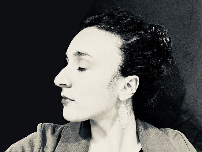
self-portrait

IMG-2512

Hi, world. Here’s an image I made of myself, on my phone. I edited a bit of the background on Photoshop. It was fun to play around with the brush tools.

I chose to make the image in black and white because we’ve been working with film for so long that color feels strange. I don’t quite know how to work with colors without the whole image feeling messy.

Does the light look realistic, given the editing? I’m not sure. I liked playing with the blacker blacks. I like to imagine myself someday with white streaks in my hair, too.

I closed my eyes because it felt easier and safer. I remember feeling beautiful on the day that I took the shot. I like the texture of my hair and I like the way that the shot communicates as sense of ease.

Having a concussion for part of this semester has been difficult, but it has made me love my brain all that much more. So much of the last month has been focused on rest. Rest is hard work, much harder than I had bargained for. I wanted to communicate some of that in this image.

Here’s to healing.

Final Project Ideas

1. Intimacy 
This would be the most clear-cut continuation of my work earlier this semester. In this work I’ll strive to achieve a closeness to subjects, but do so in a way that is collaborative and uplifting rather than exploitative. As I have mentioned before, I hesitated before taking this class to photograph people, in part because a photographer once abused a relationship of power that she had over me in order to benefit herself, to make herself feel larger and to make me feel small. It was awful. This project would be an act of healing / reclamation that seeks to involve the subject in the process of co-creating images, and to do so in a way that builds them up rather than pushes them down. This would be primarily portraits of those in my everyday life (family, friends, people I meet in the Cambridge area), interspersed with detailed close-ups and, if I can pull it off, a landscape or two.
Photographers I am inspired by for this project include:
2008_02zl0189_ver15_alec
Kylie_Stockton_California
Sunroom
2. Envisioning Climate Change  
What will Boston look like in 2050? In this series I’ll travel the perimeter of Boston’s lowest lying areas and visit neighborhoods that are predicted to be underwater. Along the way I’ll photograph people I meet, but I envision this project will be mostly landscape-focused. If I find any small / everyday objects along the way, I will photograph those, too.
I am inspired by Eve Mosher’s High Water Line project in NYC. This map can help me target which areas to visit.

Photo Resurrections

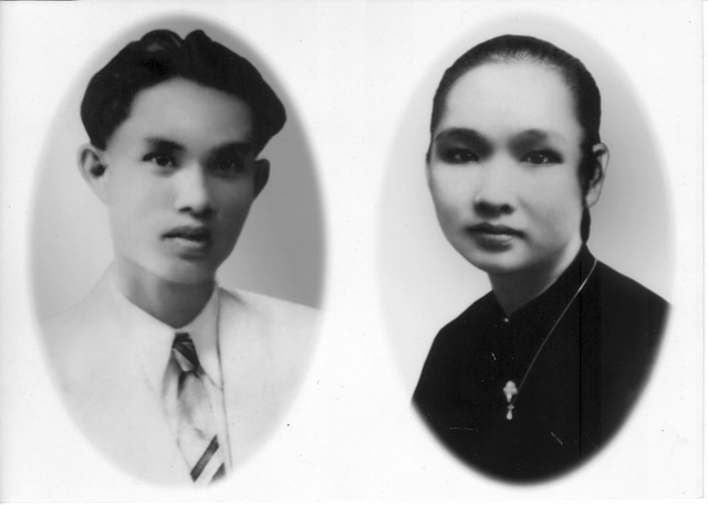
In “Before and After Images: An Ancestor Story”, Nina Hien writes about photography in the context of Vietnam, using her own family as a case study. In Vietnam, portraits are an important part of traditional ancestor worship practices: “Portraits act as the beacons and landing pads to insure that the correct ancestors have arrived at the right homes. (Otherwise, havoc could ensue if the wrong souls entered.)”

Next, Hien examines the function of digital photo recovery shops in Vietnam. These shops create composite family portraits “by grafting together the individual photos of members who had been dispersed all over the globe and virtually ‘reunifying’ them in Saigon living rooms.” The shops also altered old photographs that were ID images or headshots, transforming them into altar images.

Hien decides to have a photo of her grandparents retouched at one of the shops in Vietnam. Hien walks us through a “digital cut-and-paste organ transplant” in which a rogue ear was pasted onto her grandmother’s head in order to make her appear more highly idealized.

Figure 2: my recovered grandparents, Tinh Hoa shop, 2002
via Nina Hiam

Next, she examines a family portrait from 1921 in which the insignia on a traditional tunic garment with a long history of connection to the bourgeois class was scraped off the photograph. “This defacement was apparently intended to hide the particular status that the symbol marked, but not destroy the image,” Hien writes. “I wonder what exactly were the circumstances that made this photograph dangerous enough to need to be damaged.”

Figure 3: Family portrait of Bui Quang Nam, c. 1921
via Nina Hiam

Questions:

Have any of your family photographs been retouched? If so, how? 

What circumstances might make a photograph dangerous, especially a benign-seeming family portrait? 


Write 2 or 3 paragraphs reflecting on the readings and prepare 2 or 3 questions for the class discussion

Cyanotypes

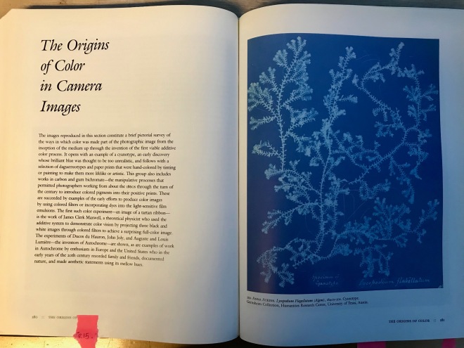
IMG_2387

I made a trip to the library today to find Naomi Rosenblum’s “History of Photography.” One process that I found striking is the cyanotype. In order to make a cyanotype, a piece of fabric or paper is coated with an iron salt solution. The power of the sun then exposes the sheet, leaving an imprint of the image behind when you rinse / process it.

On a chemical level, ferric ammonium citrate and potassium ferricyanide are mixed. Exposure to UV light makes ferric ferrocyanide, which gives the print its distinctive blue.

Cyanotypes were used to create copies of architectural plans––hence the name “blueprints.” While the process now is different, the name has stuck.

File:Boiler seam blueprint.jpg
blueprint for a boiler seam, via Dead Media Archive

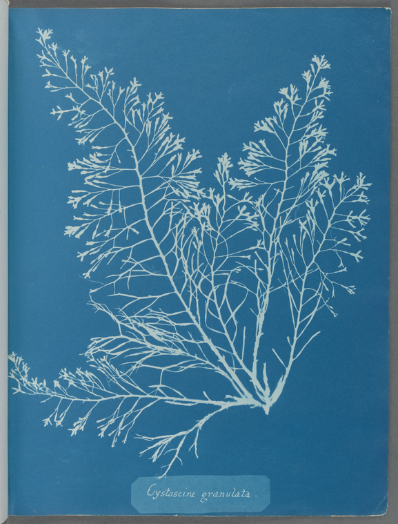
An early photographer who used this technique in the 1840s and 50s is botanist Anna Atkins.

Index
Cystoseira granulata, via New York Public Library

A present-day artist who uses cyanotypes in her work is Carol Flueckiger. I met Carol through a friend of a friend. She contacted me this summer to ask if I would make a solar-powered print of my touring bicycle. I said yes.

Elsewhere Studios, Paonia, CO
Elsewhere Studios, Paonia, CO / cyanotype on fabric, 96×108, 2017

Carol sent a package in the mail with pre-treated fabric, and a set of instructions. I was to place the fabric in a sunny place on a low-wind day, and immediately put my bicycle on top for a certain number of minutes. Then I was to fold up the sheet, put it in a black plastic bag, and mail the fabric back to her for processing.

Unfortunately the sun in New Hampshire isn’t as strong as the sun in Texas, where Carol is based. It turned out a bit faint. That said, this is a process I would love to attempt again. Maybe this calls for a trip to sunnier pastures. I have never been to Texas (save for a layover once in an airport, which doesn’t count).

On a different topic, here are some phone photos I shot this afternoon, on a whim. I was walking down a stairwell with excellent golden hour light and couldn’t resist. I’ve been thinking a lot lately about a topic that came up in our first lecture: how images compress time and space and shape into a single layer. I played around with that here, and I want to keep playing. It was fun.

Image may contain: sky and outdoor

Image may contain: shoes and sky

Onwards.

Learning to critique (+ a dash of Baudelaire)

In “Criticizing Photographs,” Terry Barrett identifies steps to critiquing photography:

  1. Describe the image. What is there? Answer the obvious questions––what is obvious to your eye is not necessarily obvious to someone else’s.
  2. Interpret the image. What cultural and physical context is the image emerging from?
  3. Resist the urge to judge first. If you must judge first, revise your judgment based on description. Only evaluate after steps 1 and 2.

Next, Barrett looks at how Douglas Davis describes, interprets, and evaluates Richard Avedon’s exhibit “In the American West”, which opened in 1985 in Ft. Worth, Texas. The article appeared in Newsweek. Barrett maps the review according to the 3 parameters above.

Subject matter is different from subject. Subject matter is the physical stuff in the frame. the subject is the larger idea that the image stands for. In reviewing a photograph, Barrett emphasizes that it is important to describe the subject matter as viscerally as possible.

We can also describe form: “dot, line, shape, light and value, color, texture, mass, space, and volume… black and white tonal range; subject contrast; film contrast; negative contrast; paper contrast; film format; point of view… angle and lens; frame and edge; depth of field; sharpness of grain; and degree of focus.” Other formal elements are “principles of design,” including: “scale, proportion, unity within variety, repetition and rhythm, balance, directional forces, emphasis, and subordination.”

(I don’t understand what subordination means in this context. Do you?)

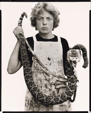
Boyd Fortin, Thirteen Year Old Rattlesnake Skinner, Sweetwater, Texas, 3/10/79
Via The Guardian

It is important to describe medium, or what an art object is made of. This could be “photograph”, “photogram”, or a description of the objects that were used to make each. We can also consider the type of camera, kind of lighting, size of the film, and how the prints are made.

Style refers to how a specific art object fits into other objects made in that same time period, location, movement, or among objects made by the same artist. This is more interpretative than descriptive.

It is also useful to compare and contrast the artwork to other bodies of work made by the same photographer, or by others. This can also happen across artistic disciplines. Photographers don’t have to only be compared to photographers.

A critic can also draw on external sources such as biographical information that help put the artist’s work into the context of their life story.


————

Baudelaire’s poems evoke a kind of minimalism, a loss of identity:

– Well then! What do you love, unfathomable stranger?

– I love the clouds… the passing clouds … up there … up there … the marvelous clouds!

Symbols become more important than the objects themselves (which is, I suppose, the essence of a photogram):

Nature is a temple in which living pillars
Sometimes give voice to confused words;
Man passes there through forests of symbols
Which look at him with understanding eyes.

Hello, high contrast

Here are three photographs by Daido Moriyama that feel simultaneously intimate and distant.

The lace in the first image makes me think of the massive photogram we made as a class of the 1960s World Fair tablecloth.

I love how, in this one, the buildings meld into fog. The composition is fire, too. The edges on the lower buildings at the top left and bottom right give the higher buildings an air of mystique.

And looking at this image makes me what to photograph tights. In terms of angles, Moriyama is unafraid of going over / under people and places and buildings.

Also, his darks are super dark. I wonder what kind of a background / lighting situation he was using. Flash in the dark? A lamp?

A new vision

In “From Pigment to Light” (1936), Laszlo Moholy-Nagy writes: “The photogram opens up perspectives of a hitherto wholly unknown morphosis governed by optical laws peculiar to itself. It is the most completely dematerialized medium which the new vision commands.”

László Moholy-Nagy, Untitled (Self-portrait), Dessau 1926, printed 1935. Gelatin silver print of an enlarged photogram, 97 x 68 cm
László Moholy-Nagy, “Untitled” (Self-portrait)

Photograms are photographs stripped to their most basic essence: an image made without a camera. Objects are placed on top of a light-sensitive paper, which is then exposed to light.

Image result for László Moholy-Nagy, photogram untitled, 1943
Laszlo Moholy-Nagy, “Photogram Untitled” (1943)

Looking at these images does feel elemental––stripped. These are not forms that exist in black/white/grey in day-to-day life. They are highly manipulated. Composed. They make the minuscule feel architectural. Shape takes precedence over all else (closely followed by transparency)

—-

In “The Age of Light”, Man Ray writes: “All progress results from an intense individual desire to improve the immediate present, from an all-conscious sense of material insufficiency.”

Ray is preoccupied with rising above race and class, which I find problematic. Recognize your white privilege, Man Ray.

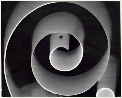
Rayograph, Man Ray (American, Philadelphia, Pennsylvania 1890–1976 Paris), Gelatin silver print
Man Ray “Rayograph” (1922)
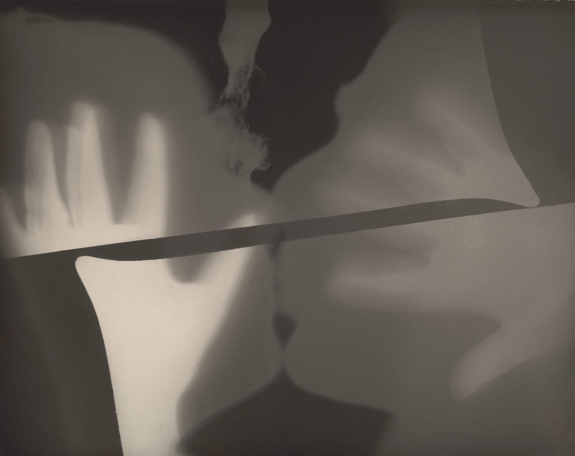
Man Ray “The Kiss” (1922)


“Art’s most mortal enemy”

In On Photography, from The Salon of 1859, Charles Baudelaire argues that photography is not and cannot be considered art. “This industry,” he writes, “by invading the territories of art, has become art’s most mortal enemy.”

Baudelaire would rather confine photography to its “true duty, which is to be the servant of the sciences and the arts.” He writes that photographing for tourism is okay, as is photography used to corroborate an astronomer’s hypotheses, or enlarging microscopic animals. Photography as archive is also okay: “Let it rescue from oblivion those tumbling ruins, those books, prints and manuscripts which time is devouring, precious things whose form is dissolving and which demand a place in the archives of our memory—— it will be thanked and applauded.”

But photography, he argues, cannot be part of the domain of art, because, lo! it doesn’t ad anything to our souls: “But if it be allowed to encroach upon the domain of the impalpable and the imaginary, upon anything whose value depends solely upon the addition of something of a man’s soul, then it will be so much the worse for us!”

I mean, okay. I get that it was 1859, and photography was a new kid on the art block. But if Baudelaire were alive today, would he really see photography as soulless? Why is he so threatened by photography-as-art in the first place?

Lot 114: 112.500 euros ont été offerts pour ce portrait de Charles Baudelaire par Étienne Carjat, le dernier connu à ce jour. © Sotheby’s / Art digital studio.
Baudelaire had very nice hair

Pivoting to the Lewis Carroll poem “Photography Extraordinary”:

I have to be honest. I love poetry, but I don’t know how to read this one. Where is the image in the verse? I can’t visualize it.

“The Milk-and-Water School” <— is this the dark room? I thought we weren’t supposed to have food in there.

“Alas! she would not hear my prayer!” <— who isn’t hearing? I thought we were talking about schools. Does the school have a gender? Do we have a female photographer? (Please, let there be a female photographer)

“The Strong-Minded or Matter-of-Fact School” <— is this some reference to Baudelaire’s assertion that photography should only be matter-of-fact, and can never be art?

“Nothingness is my destiny!” <— still coming up empty on this one. Who is the speaker? Who is the speaker of the poem addressing? And what on earth does this have to do with photography? For a poem that purports to be about extraordinary photography, it is surprisingly lacking in visual details.


Lewis Carroll (Charles Lutwidge Dodgson), author of Alice's Adventures in Wonderland. Photograph portrait © National Portrait Gallery, London.